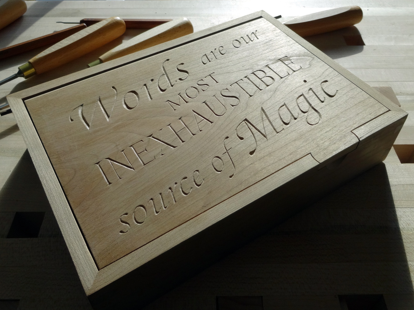
 “Words are our most inexhaustible source of magic.”
My wife, a linguist, lifelong student of many languages and an English pronunciation teacher was immediately enchanted when she first heard these words.
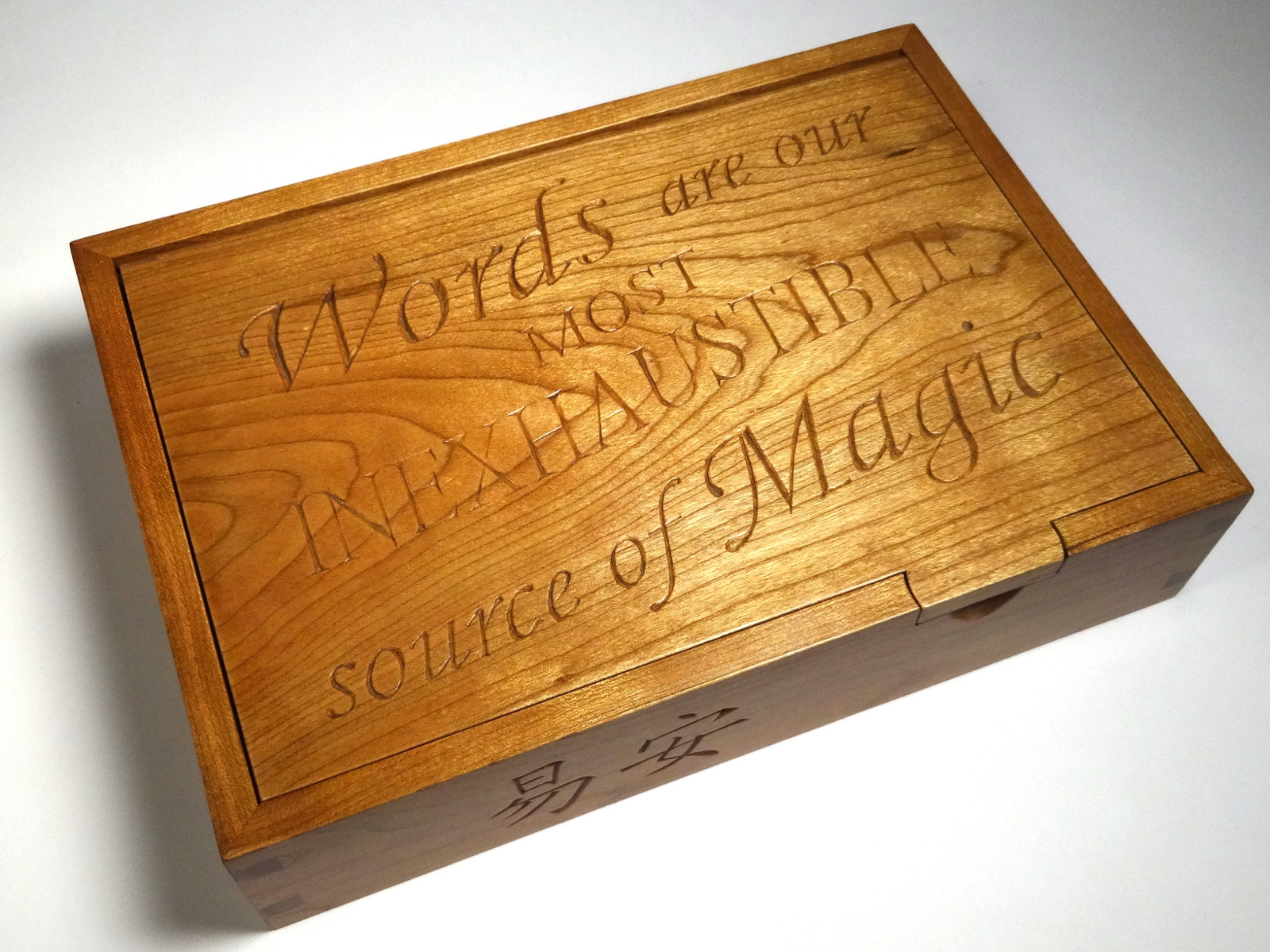
The box is for her, with two inscriptions making it a very special box. The second inscription is the pair of Chinese characters on the front of the box, her Chinese name. No, she’s not Chinese. She’s as Western as I am Hoosier. Chinese people sometimes offer non-Chinese friends an honorary Chinese name. This name is a gift from one of her language partners who lives near Beijing. He bestowed this name because it is the pseudonym of a premier Chinese poet he admires, Yi’an Jushi. A reasonable translation is “Amiable Calm.”
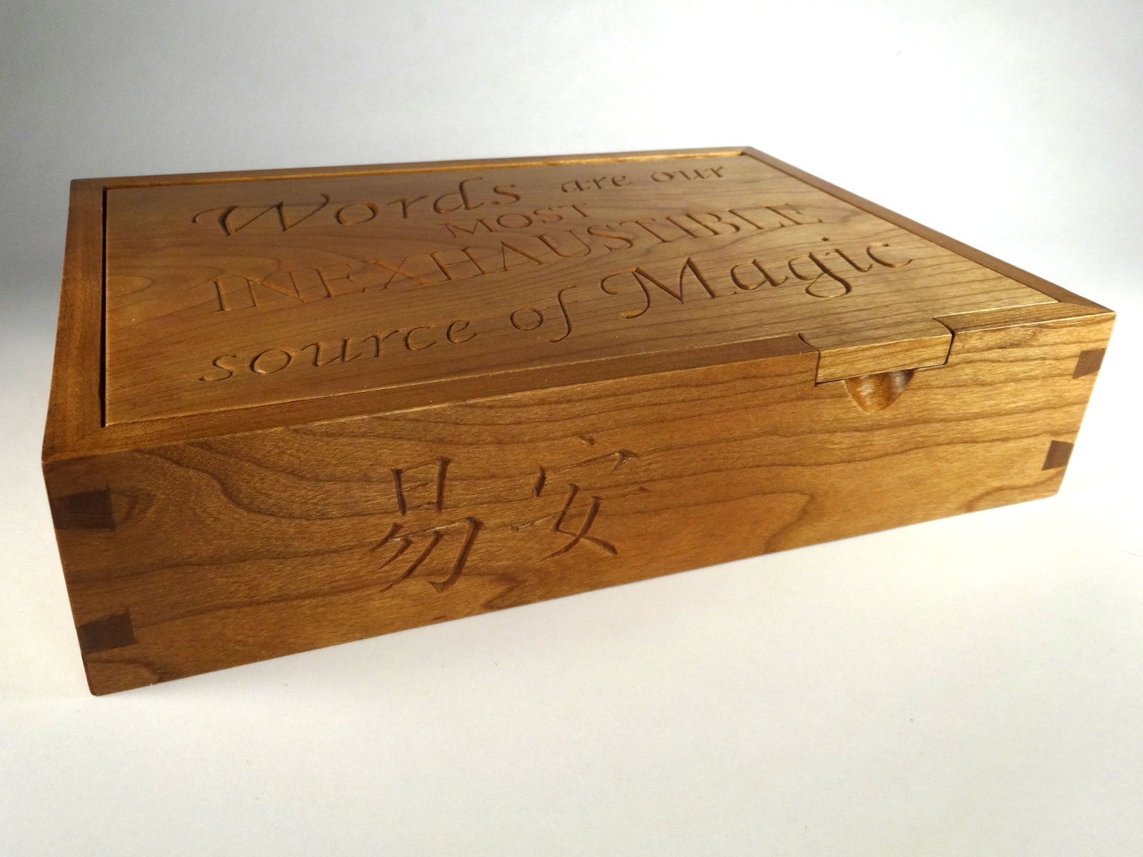
The box is intended as a desk box, something of convenient size for everyday use on her desk. It measures 9 inches long by 5 and 5/8 inches wide by 2 inches high. The box is made of mostly cherry. All of the cherry parts are 5/16 inch thick. The floor is 1/8 inch thin walnut. The finish is wax over shellac, several coats of each, with a lot of rubbing and buffing.
This box uses my current favorite box construction. I like dovetailed corners, but I don’t like butt joints showing at the edges. I also like the floors set in grooves, but I don’t want any through grooves showing. Plugging exposed grooves is ugly to my eye. So, I use joinery that features dovetails in the middles of the joins and miters at the tops and bottoms. 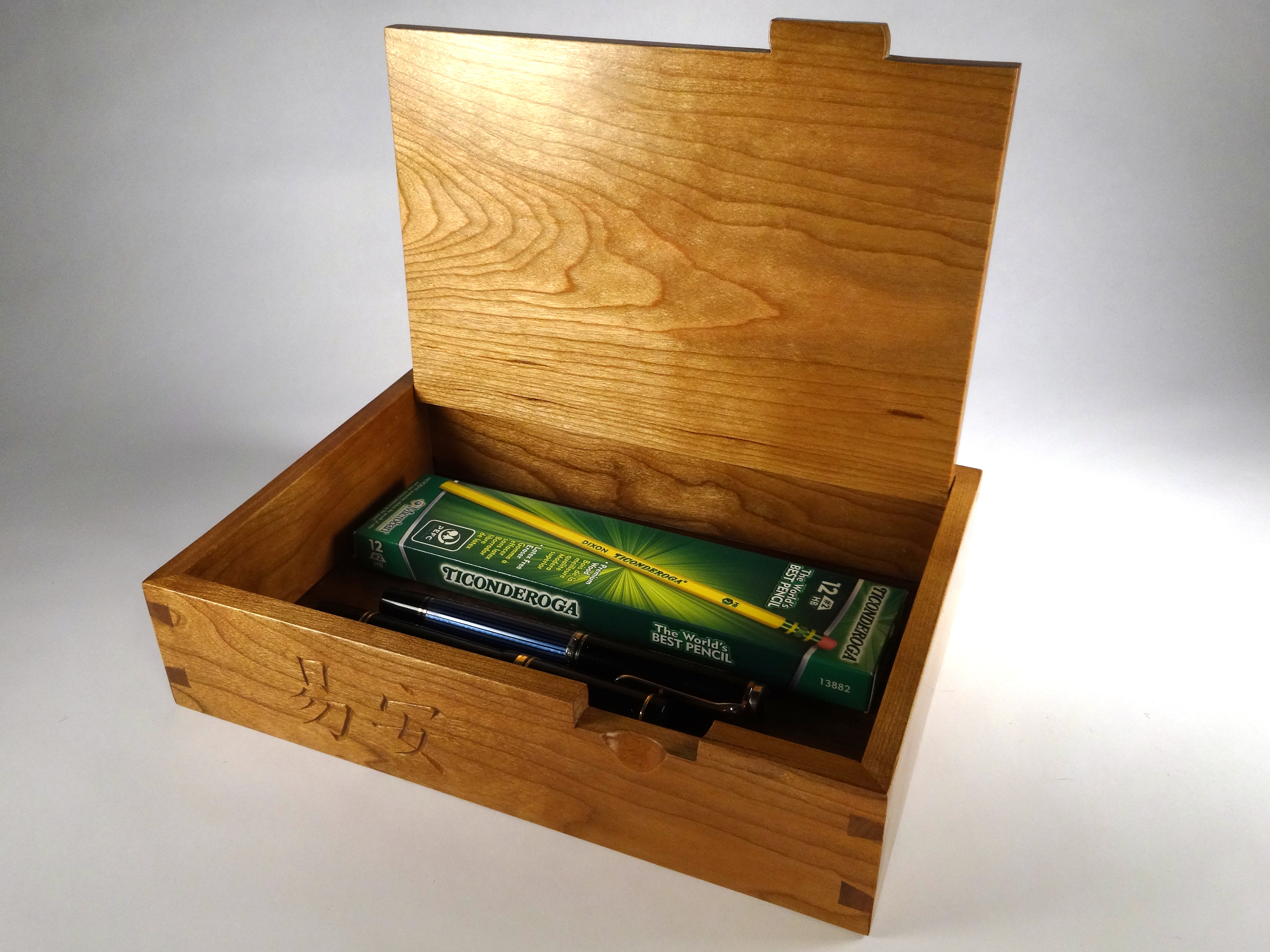 The technique eliminates butt joins, leaving beautiful miters and by strategically placing the groove, hides the grooves. Miter tip later…
Lastly, the tilt lid, from Peter Lloyd’s “Making Heirloom Boxes,” makes for easy use. The lid opens to just a bit beyond 90° which let’s it stand open nicely. The hinge pins are walnut. The lift tab is shaped to echo the bottom loop of the “g” just above it. The notch is a simple scoop.
Lettering layout
Which brings me back to the lid inscription, the part that took the longest. The cherry parts were prepped almost a year ago, as was the walnut. It wasn’t until last fall that I got serious about the inscription.
I started with a lettering layout that used all Roman capitals, the norm for so many inscriptions. It was too “flat” for my tastes. I wanted something more flowing and more cursive. My lettering design work went through about a dozen iterations, all hand drawn.
Hand drawn lettering is making a come back on the web, as are hand painted signs in the brick and mortar world. After years of computer drawn fonts and plastic lettering, many designers are looking for something different and more human to polish their designs. So, there’s a lot of hand drawn lettering showing up. Some of it is really good. A lot is terrible! In an effort to draw attention to “hand drawn,” many of these designers go to extremes to make “hand drawn” obvious by making the work wildly imperfect. Too often, the result is hand drawn letters that look childish and amateurish.
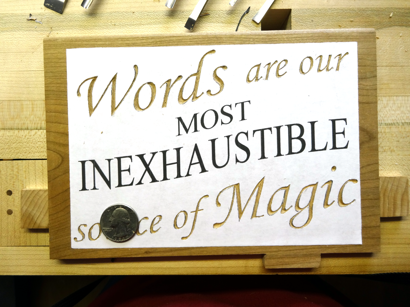 Many decades ago, I watched my father do nearly perfect hand painted lettering. That’s the quality level I wanted, not childish dreck. A dozen or so iterations later, I landed on the design I like, … and she liked it too.
Now, to carve it. This lettering differs from most of my previous experience in scale. The lower case cursive letters are only about 1/2 inch high. The Roman caps in “Inexhaustible” are about 3/4 inch high. All are very much smaller than I’ve carved before and I’ve learned that difficulty increases as the size shrinks. Those 41 characters were preceded by well over 200 practice characters. I carved some of them over and over and was repeatedly disappointed. It turns out that “the secret” to success is in how the pattern is transferred to the wood. Most of my practice cuts were done by using carbon paper to transfer the design to the wood and then cutting. It was too easy to be inaccurate. Being off by the width of a half-millimeter pencil line was enough to throw off the look of a letter. Over and over, the results were unsatisfactory.
The answer was to scan the design, make it a computer hosted image, print it out and glue it to the wood with rubber cement. Cutting through the paper eliminated the inaccuracy that was based in tracing and immediately led to good results.
Smaller gouges were in order for this smaller work. For the most part, I used full length gouges, but in narrower widths, #1 1/4 in fishtail, #1 3/8 in., #3 1/8 in., #3 3/16 in. fishtail, #6 1/4 in. and a set of 6 #8 micro gouges that ranged in width from 1/16 ” to 1/4″. The #3 fishtail did most of the work.
For those interested in lettercarving, Mary May has several lettercarving lessons at her online school. Albeit, they’re larger, easier to manage letters.
For readers interested in learning really high quality hand learning, take a look at Sean McCabe’s online lettering course.
If your interest is hand painted signs, I’ve found these two links interesting.
Perfecting the mitered corners
Now for the mitered corners. I mark the miters with a standard layout square and cut them by hand with the same fine back-saw that I use for dovetails. I don’t use a miter box for these; just cut freehand, only to the depth needed. I cut just outside the line, leaving about half a kerf-width room to trim. As the dovetail joints come together these miters fail to join because they are “fat.”
Making them fit perfectly is simple. I learned this technique from Doug Stowe’s book, “Simply Beautiful Boxes.” It works like this: When the dovetails are about one saw kerf width from being completely joined, press the miters together (holding square) and then use a very fine Japenese pull saw to cut a simple kerf through the middle of the joint. That effectively trims both pieces. Repeat to narrow the gap. Voila, perfect joint!
Inscription source
Lastly, the quotation for the lid is from Prof. Albus Dumbledore in “Harry Potter and the Deathly Hollows.”
references:
mitered dovetail joints: Fine Woodworking – Matt Kenney – “Two Ways to Build a Box”
fitting the miters: from Doug Stowe’s Simply Beautiful Boxes
tilt lid design: from Peter Lloyd’s Making Heirloom Boxes