• Skip to primary navigation
  • Skip to main content
  • Skip to primary sidebar
  • Skip to footer

Bob Easton

Chocolate powered woodworking

  • Home
  • Grinling Gibbons Tour

Lettercarving

Learning Lettercarving – part 1 of ???

July 8, 2011 by Bob Easton 1 Comment

Practice is something often thought of as preparing to do or learning to do. We even have a quotation: “Practice makes perfect.” Then, there are doctors and lawyers. (hmmmm?)

Having been at this lettercarving learning activity for a few weeks now, and not yet carved a complete word, something tells me there could be a very great number of parts to such a series. That is, if I were willing to document all of them for you. I won’t.

photo of book coverMy virtual teacher is Chris Pye, a British carver of the traditional school. His book, “Lettercarving in Wood: A Practical Course” is the lettercarving “bible” for traditional techniques. His book teaches both incised lettering and raised (relief) lettering. Incised lettering is more exacting than relief by an order of magnitude and consumes the lion’s share of the instruction. Chris’ emphasis in the book is with the traditional / architectural style found originally on Trajan’s Column in Rome.

Chris also presents a short version of “All you need to know are 4 techniques” in a DVD made as part of a Rob Cosman series: Rob Cosman Master Craftsman Series “Woodcarving #2 Letter Carving with Chris Pye” DVD. The DVD is very good at showing the actual motions that are sometimes difficult to imagine from words alone. photo of Rob Cosman DVDOn the other hand, a DVD can offer us about an hour of illustration, while a book can offer many more hours of detail. If you’re interested in learning these traditional techniques, get both. (Be prepared to wait for the book. The more recent US publication is out of stock everywhere, and Amazon took only three months to get me a copy from the original British publisher.)

The four basic techniques (straight elements, serifs, junctions, circles) are explained and demonstrated on the DVD, but make up 23 lessons in the book. [As an aside, Chris has recently started a new site, Woodcarving Workshops which consists of a growing collection of excellent videos. These videos are self-produced to a very high standard. Instead of long rambling things where one can sit through every single (often numbly boring) cut, these videos are short, clear, and concise. Unfortunately, none cover incised lettercarving and Chris believes he is constrained from producing on that topic by the two previous publications, thinking those publishers might sue should he produces competing material. My opinion is different, that web videos are a new publishing genre. Yet, I don’t know what “exclusive” arrangements he has in his other contracts.]

photo - 4 frame collage
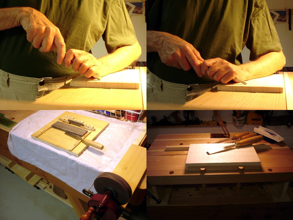
My practice, so far, is to start with a big thick piece of Heinecke’s northern basswood, 7 inches by 12 inches by 2 inches. Layout some practice exercises (vertical trenches illustrated). Repeat them until I gt the hang of the particular exercise, or the surface is full. Once full, a large #9 gouge hogs off the work, and #6 and #3 gouges are used to level the surface back to something approaching flat. Why not just plane it down quickly instead? Because the gouge technique is also used for lowering backgrounds in relief carving and is a good way to introduce another type of practice. Rinse, lather, repeat, until the board is too thin for further practice.  Then, start a new block. There are several hundred letters inside a practice block, all reduced to chips for the compost pile, and to (let’s hope) some modest level of lettercarving skill.

Oh yes, there are pictures along the way, some documenting interesting problem areas. But, you don’t get to see those… (at least not yet.)

Filed Under: Lettercarving

Commissioning chisels

June 27, 2011 by Bob Easton 4 Comments

Lettercarving needs a different set of chisels and gouges than those used for small in-the-round carving. Consequently, there are quite a few brand new Ashley Iles tools on my bench. These carving tools are superb, strong enough for very heavy work, and comfortable in hand. They arrive almost sharp enough for immediate use; a little stropping takes them the rest of the way. However, their cutting angle is steeper than I prefer. To Ashley Iles’ credit, they grind to an angle suitable for hardwoods, a safe choice for creating a strong edge, about 30 degrees. Much of the lettercarving work, especially raised letter relief carving, wants a lower angle. Notice how the lower angle lets more of the forward hand rest steady upon the work, and eases the wrist angle of the other hand. They really push noticeably easier. (The only tool left with a high angle the v-tool, which requires more courage to regrind.)

photo collage of chisel angles and sharpening stationSo, I’ve been “commissioning” these new chisels and gouges. My sharpening has long been based on the “scary sharp” sandpaper technique. I took this time, with a lot of work to be done, as the time to switch to stones. My choice is oilstones, from coarse India stones to translucent Arkansas stones. Yes, I considered water stones, all the rage these days, but decided against them because there are many narrow gouges that make trenches in the stones and require very frequent flattening. Those narrow tools won’t cause the same havoc with Arkansas stones. My new sharpening station is as simple as I can make it, a hand cranked wheel that gets held in the end-vice when needed, and a single board with several fixtures. Stones are kept in place with simple fences. There’s room in that corral for a 1/2 inch thick piece of glass for those times when I want to sharpen plane irons held in a sharpening jig. The 3 little strips on the back side are depth stops for putting plane irons into the sharpening jig. The spring clips are for holding slipstones. All very simple, easy to use, and easy to put away.

In other news – “Man Caves”

Amanda DeMatto wrote me a few months ago, asking about my garage workshop (discovered earlier in this blog). She is a freelance writer who sometimes publishes in Popular Mechanics. Her latest features 7 interesting garage conversions which she has titled “Ultimate Garage: The 7 Most Extreme Man Caves.” I never imagined my simple workshop would be considered “extreme,” but she gives it space in photos 15-19. THANKS Amanda!

Filed Under: Lettercarving

Give Me an “E” Please

June 19, 2011 by Bob Easton Leave a Comment

photo of the bench top bench holding a practice blockThat Bench on Bench was built with good reason. Here’s the start of a new journey: lettercarving.

Hand carved lettercarving. Not machine carved. Not routed.

Signs are such a pervasive part of our everyday existence that we rarely think of how they are made. Most, these days, are computer generated in some way and produced through a variety of automation. Early in Dad’s art career he painted signs: shop window signs, store front signs, signs on trucks, gold leaf signs on bank windows (there’s a lock picking story with one of those banks), signs in every imaginable form. All were hand lettered, with letters of all styles flowing magically off long bristled brushes. There was a certain period when the Interstate Commerce Commission required great long strings of registration numbers be painted on the door of every commercial vehicle. While we detest government regulation, that one found Dad frequently lettering trucks and put a lot of food on our table.  About the time that adhesive, die-cut, plastic lettering came along those regulations eased and reduced the need for hundreds of numbers on every truck door. Long stories short, I have an affinity for hand lettering.

Once in a rare while we come upon a sign with three dimensional characters, and on close inspection usually find that it was power routed. Then, far more rarely we find hand carved work from Kari or maybe Chris Pye.

photo ob book coverChris “wrote the book” about hand lettercarving a dozen years ago. It’s out of stock every place I looked in the U.S., and the world’s largest bookseller needed only 3 months to fetch me a copy from the British publisher.

The book is excellent and I’m slowly working my way through it. One thing is certain. There’s not much forgiveness in lettering, especially incised lettering … where the letters are carved into the wood. I’ve been doing lots of incised practice.

Taking a break from practicing incised letter trenches, hundreds and hundreds of them, I did my first raised / relief carving.

About 40 years ago, my wfe swished a paint brush around for 2 seconds to produce this character, a stylized “E” that we have used since. It made a good subject for my first raised letter.

photo collage showing 4 stepsThe first cuts were with a 60 degree v-tool, an Ashley Isles tool at it’s original grind. It works very well but has a higher cutting angle than I prefer. I just haven’t screwed up the courage to change it. … and forgot to take a picture just after the outlining.

Next, everything that is not part of the letter is the ground, and the ground is lowered, using #9 and #6 gouges, about 3/32 of an inch. Then it is leveled with a wide #3 gouge.

“Setting in” started up there around the ball. Setting in is the tedious part, the work of carefully setting the edge bevel exactly where it belongs. It needed quite a range of gouges and some very careful trimming with a fishtail chisel that also doubles as a surgery scalpel.

Then, the ground was fine tuned. Grounding in the small space was a challenge. Some of my smaller palm tools helped there.

After that, I stopped and made a simple “froster” by filing spurs into the end of a carriage bolt. You can see the end of it in the lower left photo.

The froster is to texture the background. The first stage is a quick outline with the v-tool. Next, tap the froster all around the edges of the letter, right at the base of the bevels. Then, the rest of the ground is done by keeping the froster suspended about 1/8 inch off the ground and moving it all around while tapping with a hammer. (and trying not to let it get onto the edge framing)

Then, a single coat of clear satin was applied to seal the bevel edges. That was followed by a 320 grit sanding of the letter face and a red acrylic wash on the ground, and trimming to final size.

Filed Under: Lettercarving

  • « Go to Previous Page
  • Page 1
  • Interim pages omitted …
  • Page 3
  • Page 4
  • Page 5

Primary Sidebar

Footer

Recent Posts

  • New Frame Saw / Scroll Saw
  • Lamppost Sign
  • Goodbye PayPal – Goodbye Bob’s eBooks
  • Anarchist’s Workbench is Done
  • Why we keep offcuts…

Categories

  • About
  • Artwork
  • Boatbuilding
  • Boating
  • bowl carving
  • Boxmaking
  • Clocks
  • Drawings
  • eBook
  • etude
  • Eva Too
  • Eva Won
  • Fiddlehead
  • Fiddlehead model
  • Flying
  • frame saw
  • gilding
  • green woodworking
  • Grinling Gibbons
  • Guns
  • Hand tools
  • Humor
  • kerfing plane
  • Lettercarving
  • Mill Creek 13
  • Model building
  • Power tools
  • Rant
  • resawing
  • scroll saw
  • Shopmade
  • sign painting
  • Stonework
  • Swimming
  • Technology
  • The Wall
  • treadle lathe
  • Uncategorized
  • VSD
  • Woodcarving
  • Woodturning
  • Woodworking
  • workbench

Other stuff

  • About
  • Contact
  • Privacy Policy

Copyright ©2024 · Bob Easton · All Rights Reserved